
Ok, I have been getting this house ready to sell for way too long and had about hit the end of my nerves. But as Dr. Panosian would say on every test day in History of Civilization, “This too shall pass away,” and the worse is over. I still see things that should be done but as the house is on the market now (anyone need a nice house and great situation in the Spring area?), I took a break and wove a triaxial pattern I found in a picture. I needed three largely contrasting colors for it to show well but didn’t have enough of anything in my stash so went with these. Not enough contrast but as I couldn’t go get more – I dug in with these.
First go at it
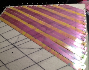
So I started laying and cutting.Thought I had it and got this far (above) and realized that it just couldn’t work this way. So I took it apart and…

A second go at it
Now I realized after getting a whole first layer done that the yellow stripe (And yes for those who know me well, I really hate yellow but this came with the others and I needed contrast so here it is. At least it has some pink to it and is only a third of one layer.) needed on the second layer. So once again it was all taken apart and I got paper out and started again to figure out the pattern. I should have taken a picture of that page and all the chicken scratches, but I did finally get it. So once again…

Third attempt
Now one thing I learned in this process was how these ribbons change their look in different light and angles. Yes, I wasted a bit of time just playing with it in the light. The first two pictures show the three colors well on their own but once getting on with it they really muddled up depending on the light. They also are iridescent and can change their color a bit on their own. Oh fun with the definite pattern I was wanting.

Ceiling lights

Natural sunlight
Ok I loved the difference of the colors and no I didn’t like natural light as the iridescence of the ribbons were lost – at least here but with the lights on it was a bit more pleasing to me. And on we wove.

All woven
So I finished the weaving well after dark and the room had no natural light at all and the colors became more vivid. I got it backed and cut and then at an angle I managed a great picture of the actual pattern in it. (Too see it well click on it.)

The pattern is now visible
So now I really want to try this with different ribbon that is highly contrasting. But alas after this was completed I had to try one more thing I have never done before with these and held it up to the light to look through it. The ribbon is not totally opaque so you could see the rows of ribbon and it took on a whole new life that I actually really love.

Held up to the light
Whereas the yellow was just a dot every so often before now you can see the complete rows of yellow as well as the blue stands out. The pink steps back though there is more of it than the other two. It does make lovely hexagons. I wish I could frame this one with a light behind to see it like this.

I don’t really know enough about weaving to understand the process here but the results are fascinating! The colorplay and the variation is endlessly exciting!
LikeLike
There are several names for this type of weaving. Instead of the normal two directions at right angles on a loom, this has three directions at an angle I forgot the number (numbers aren’t my strong suite). It is a great form of weaving without much equipment and for a lot less money. I wish the gal that I learned from would write a book as I haven’t found anyone else that does it as easily as she does.
LikeLike
This is really great, Julia. There are floating frame kits available that do not have an opaque backing. Try Michaels or online.
LikeLike
Thanks Pat. I may have to see what I can do with it to enjoy both ways.
LikeLike
Julia, It’s fascinating how changing the light affects the pattern and design.
LikeLike
I am going to have to try this sometime – fascinating!
LikeLike